NOTE: This post was originally published on January 22, 2021
You may have noticed ExpressVPN has a new look and feel this week, just one component of an exciting new era for our company as we continue our mission to build a safer digital world. With new features, new technology, and a refreshed brand, we want you to feel the full possibility of online exploration. (What can we say? We’re ambitious around here!)
The new ExpressVPN visual identity is a window into the vast, inspiring possibilities of the online world—portrayed in an expanded, vibrant color palette, a new, more expressive illustration style, and a new logo, along with other changes to the website and our apps.
So how do you translate an idea and a feeling into a unified visual identity? We sat down with our design director and VP to hear more about the journey that’s helped usher in this exciting new era for ExpressVPN…
This is a design overhaul on a scale we’ve never seen before at ExpressVPN. What was the impetus?
Ryan Neebe, design director: The short answer is, the clothes weren’t fitting quite right anymore. We’ve been leading the VPN industry in innovation—TrustedServer, Lightway, Digital Security Lab, etc.—but our look and feel wasn’t quite as cutting-edge.
Harold Li, vice president: And, looking beyond the core VPN features, we’re introducing an expanded suite of privacy and security tools in the coming months and years. It’s a new era for us and our users, which called for a refreshed brand identity.
That sounds like quite the undertaking. Where did you begin?
HL: To be honest, we started small, with a misstep. We got deep into looking for a new typeface. Then we realized we needed to step back—way back. Away from the colors, logos, typography. We turned to our colleagues and users to ask a more fundamental question: What does ExpressVPN mean to you? Naturally, many talked about digital protection, but something more essential came through—how the control that ExpressVPN gives them over their privacy and security empowers them to unlock the full potential of their online experiences.
Besides digital protection, something more essential came through—how the control that ExpressVPN gives users over their privacy and security empowers them to unlock the full potential of their online experiences.
RN: That idea of Shifting Control to our users became the core of our brand strategy and it’s what we latched onto as we rethought every aspect of our look and feel, working in partnership with the brand experts at DesignStudio. It helped us think way beyond the clichés of the security industry—the padlocks, the hoodied hackers, the Matrix-like 0s and 1s.
Instead, we thought about what the online world looks like when you feel in control and safe to explore. The new ExpressVPN visual identity conveys this with an expanded vibrant color palette, new expressive illustration style, and much more.

HL: And that melded really well with another objective we had: Making every aspect of the user experience more approachable, personal, and positive. When talking about safety online, it’s easy—tempting, even—to focus on the threats, fears, and complexity. That can be disempowering or intimidating to many. We believe that privacy and security protection is for everybody, of all levels of tech-savvy, so we wanted to make sure it feels welcoming and relatable to all, not just through our products, but also our visuals and words.
Ryan, as a designer how do you even approach a challenge like that, making privacy and security accessible, even tangible?
RN: Design is not about individuals making things. It’s a series of connections. Design is the intersection of people, craft, and the experience made possible for others.
The goal was to weave humanity and personality into the brand and product, to make the complex and technical relatable. What does security look like? How do you bring a change of IP address to life?
Design is the intersection of people, craft, and the experience made possible for others.
Moreover, how does a business predicated on privacy and anonymity show a human face? Our new painterly hero illustrations do just that through thought-provoking, textured, diverse, and expressive paintings that bring a human touch to complex, abstract topics. They connect us to a digital world of possibility through movement, emotion, and a sense of being in control.

Most people will probably notice the logo change first. Tell me more about that.
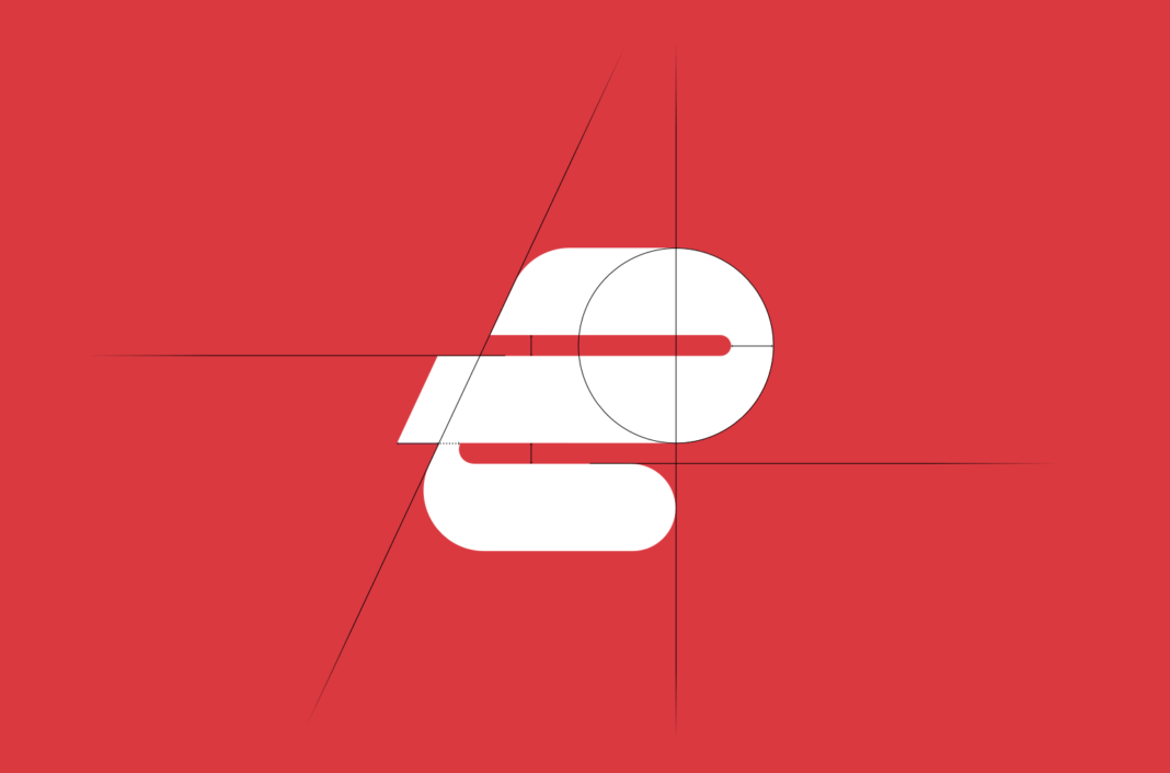
HL: Well, I’ll start by underlining a core principle for us: Design is first and foremost about a better user experience. With an expanding suite of tech and tools for our users, we needed a design system fit for purpose across a growing range of use cases, to ensure a seamless, consistent, easy experience for them, no matter their needs. The logo is a great example—it should be instantly recognizable, everywhere from a tiny menu bar icon to large-scale signage.
RN: We ask a lot of a logo. It’s a single artifact that needs to convey so much about a company. Who are we? What do we stand for? Does it align with what users know and like about us? A logo also needs to be distinct to differentiate from other brands.

HL: And, of course, given that ExpressVPN is already well established as a brand known for trustworthiness and dependability, we needed something that could carry forward and build on that legacy.
RN: The choice to use a serif typeface speaks to that aspect of established trust and authority as well, while our modernized forward-motion icon embodies our mission of helping you enjoy a positive online world full of possibilities. And of course, speed will always be at the heart of our DNA! This combination of style and tone differentiates us from the current trend of straight lines and rigid, sharp edges and the sans-serifs of the big tech companies many of our users are in fact seeking to protect their data from.
Speaking of departures from typical tech brand visuals, how did the new colors and other graphic elements come about?
RN: The colors really reflect our positive vision of the online world and its possibilities. We take privacy and security seriously, but that doesn’t mean just sticking to blues and grays. There are so many more facets to your digital experience, and the expanded range of warm, rich colors enables a flexibility of expression to match that.

With the graphic language, we wanted to get away from reliance on analog tropes for safety and control. Emulating how we interact with digital devices—swipe, drag, pinch, push, rotate, and shake—we created a graphic language of motion and touch. They represent a way to unlock a new world of digital security that’s full of movement and expression.

We’ve also created a comprehensive and scalable library of graphic illustrations used to explain more concretely how our service works for users. It’s a style that works in concert with all other visual elements, photography, and user interface components to ensure users feel confidence and control as they explore online.

So that’s where ExpressVPN is in 2021. What’s next?
RN: Not to be too cheesy, but, the possibilities are endless. That’s the power of a comprehensive visual identity system. From the reusable components of a digital product interface to the expressive graphics and imagery, we’ve meticulously designed a system that will flex to deliver a cohesive, friendly experience to users as their needs change and grow.

This single source system enables us to craft and deliver apps for all platforms—and our website—with speed, consistency, and a memorable user experience that, when viewed holistically, looks and feels like a cohesive ecosystem that’s also still part of the established and pioneering ExpressVPN experience.
HL: Stay tuned—we’re just getting started!
Want to join us in building one of the world’s leading digital privacy and security brands? We’re hiring designers, copywriters, marketers, and more—see our jobs page to learn more.





Comments
I like everything about the update to security and speed, but when do I get it for IOS? I’ll update my windows version but find that I use my iPhone a bunch and am ready for any update to this platform. Thanks for thinking about ME.
Love the rebrand, love the mission.
Awesome rebrand.. I like the use of colors, and the illustrations are beautiful. VPN’s are now super cool and less intimidating thanks to this rebrand.
You should try harder on the new logo. It’s hard to look at without cringe.
Is there going to be support for native implementation for the Apple M1 Chip soon?
I find the new headings font is a complete eyesore. Instead of forward thinking it reminds of a 1960s Bible class. Please find something more modern. I really am baffled by it to the point I don’t want to visit the website anymore.
Do you have recruitment for beta testers?
Hi Douglas, you can sign up to become a beta tester: https://www.expressvpn.com/beta